
This post covers what focal points actually are, the types every retailer should use, the design principles behind them, and the mistakes that quietly sabotage them.
Key Takeaways
- Focal points direct customer attention and shape engagement from the first few steps inside a store
- Strong focal points combine placement, lighting, height, and clear product hierarchy
- Research shows end caps and displays measurably affect purchase behavior in-store
- Durable fixtures protect the impression a focal point is designed to create
What Is a Focal Point in Store Display Design?
A focal point is the spot that naturally grabs customer attention first: the visual anchor everything else in the space supports. Eyes are drawn to certain zones by height, light, color, and movement — by design, not chance.
Retail eye-tracking research backs this up. A 2021 grocery eye-tracking study published in the Journal of Marketing Research tracked shoppers' field of view and fixations, confirming that attention follows predictable patterns tied to height and sightlines.
A related virtual-retail study found shoppers gave heavy attention to a large media screen while a plain wall drew almost none. That contrast is a clear directional signal (the study itself was not a U.S. field trial).
The same idea shows up in interior design as a "focal point wall" or "accent wall": the dominant feature that anchors a room. Retail borrows it directly. A lit feature wall near the entrance or a colorful seasonal display at the front door works the same way. Each one tells the eye where to look first.
Types of Focal Points Every Retailer Should Know
Entry Statements
Think of the entry statement as your store's handshake. It's the first thing shoppers see, and it should introduce new arrivals or a seasonal campaign without overwhelming them. Best practices:
- Keep the layout clean: one clear message, not five
- Feature only a handful of hero products
- Use strong, directional lighting to draw the eye
- Refresh often so returning customers see something new Research on storefront windows found their effectiveness depends heavily on shopping motive and mental load. A decorative display may work great for browsers but frustrate someone on a mission. Design your entry statement around what your typical customer is there to do.

Feature Walls
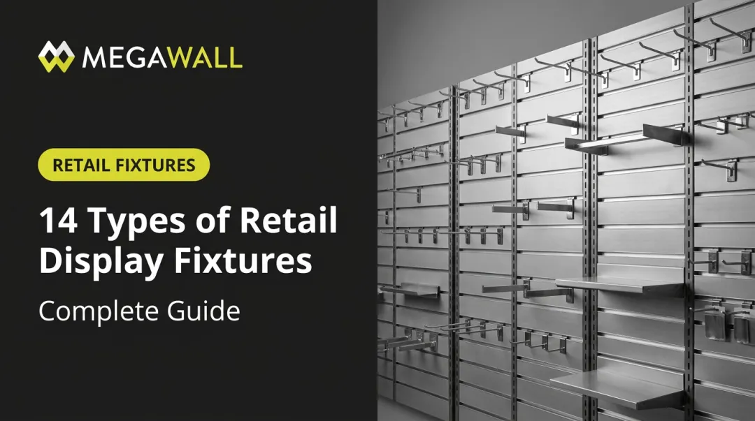
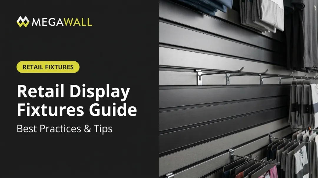
Feature walls are vertical merchandising centerpieces: a way to organize products by color, texture, or collection on a single dominant surface. A strong wall system maximizes vertical square footage that would otherwise sit empty. This is where fixture quality matters more than most retailers realize. Modular slatwall systems let you reconfigure a feature wall for every season without losing structural integrity. Megawall's steel and aluminum options are built for that flexibility:
- Steel slatwall supports over 50 pounds per linear foot with heavy-gauge, formed-and-welded construction and hidden fasteners
- Panels carry heavier seasonal merchandise without sagging or warping
- Aluminum versions offer seamless sections up to 8 feet
- Finish options include anodized, powder-coated, or custom color-matched panels for texture-based zones (think glossy Candy Apple Red next to brushed steel) One Megawall customer, Creative Studio Promotions, described their finished slatwall installation as becoming "a focal point for all who enter," noting it created a professional setting that left "a better impression — every time."

Power Displays
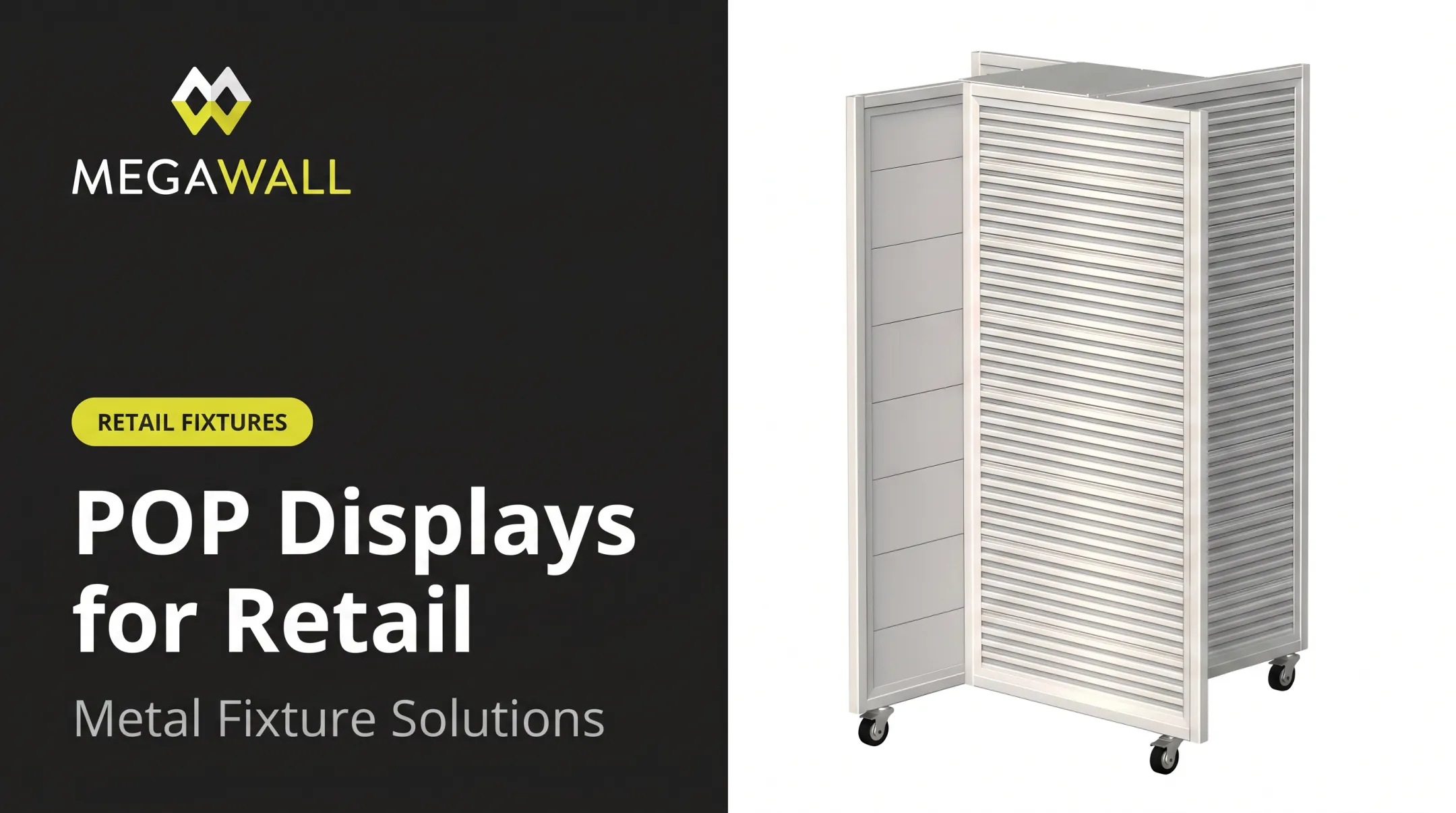
Power displays live in high-traffic zones such as end caps, aisle intersections, and checkout lanes, and they're built for impulse purchases. Unlike entry statements, they change frequently, tied to promotions or new product launches rather than seasonal themes. A 2022 Journal of Retailing study analyzing a large US grocery chain found front end caps had the biggest impact on category-level purchases, while shelf displays drove brand choice more strongly. Their optimization model produced an average revenue increase of roughly 11%. That figure is specific to one grocery dataset and shouldn't be treated as universal. Modular fixtures like an L-Frame are built for exactly this job. They're designed to create a focal point, guide foot traffic, and prompt impulse buys in tight, high-visibility spots.

Design Principles for an Effective Focal Point
A focal point succeeds or fails based on a handful of design fundamentals:
- Visual hierarchy — Use size, height, color, and lighting to tell customers what to look at first. If everything competes for attention, nothing wins.
- The rule of three — Group products in threes for a balanced composition. Odd numbers avoid the flat symmetry of pairs.
- Contrast — Pair dark backgrounds with light products, or vice versa, to make the hero item pop against its surroundings.
- Simplicity — Fewer elements mean a clearer message. Clutter kills focus.
- Lighting — Treat lighting and merchandise as one system. Supplemental light only works when it interacts with the display itself.

That last point matters. A 2001 field study in the Journal of Business Research tracked over 2,300 shoppers and found supplemental lighting changed behavior — including time spent at the display and items picked up — but only when lighting and the display worked together. A beautifully lit empty shelf does nothing. A well-merchandised display in flat lighting underperforms too. Treat lighting and product placement as a single design decision.
Where to Position Focal Points and How to Find Them
In the US, shoppers tend to scan toward the right after entering a store. A well-known 2002 study found American participants statistically favored turning right in a simple maze test, though it wasn't a retail study, so treat it as a testable hypothesis rather than a hard rule.
To find your store's natural focal point:
- Walk in as a customer would and note the first thing your eye lands on
- Stand at the entrance and check what's directly ahead or slightly right
- Watch real shoppers for a few minutes and see where their eyes and feet go first
- Adjust if the "natural" focal point is a blank wall or a stockroom door instead of merchandise
Once that position is set, keep it earning its place on the floor. Refresh focal points regularly. Monthly is a common practitioner benchmark, though the right cadence depends on your seasonality, traffic, and inventory turnover. Repeat customers should always have something new to notice.
Common Mistakes to Avoid
Even a well-planned focal point can fall apart from a few avoidable errors.
Overcrowding. Piling too many products into one space creates visual noise instead of clarity. Heavy visual stimulation can raise attention for a moment, then lower pleasure and make shoppers less willing to approach—especially less-engaged customers. More isn't better; excess product can push people away.
Inconsistency with brand style. A focal point that doesn't match your store's overall look and feel undermines the message before a customer even reads a sign. The full environment shapes how shoppers judge both the retailer and the quality of what's on offer.
Flimsy or worn fixtures. Even a perfectly designed focal point falls apart if the fixture underneath it looks cheap, sags under weight, or shows wear. This is where construction quality shows up directly:
- Heavy-gauge steel and aluminum resist warping, breaking, and delamination common with conventional MDF fixtures
- Hidden fasteners keep the appearance clean instead of cluttered with visible hardware
- Durable, easy-clean finishes maintain a polished look over months of heavy handling
Stronger, low-maintenance display systems protect the impression a focal point is meant to create, so a worn fixture doesn't undo months of merchandising work.
Frequently Asked Questions
How do I find the focal point?
Walk through the entrance as a shopper would and note the first thing your eye lands on, usually straight ahead or slightly to the right. That natural landing spot is your focal point.
What is a focal point wall called?
It's commonly called a "feature wall" or "accent wall" in both retail and interior design. The terms are largely interchangeable, referring to a dominant vertical surface that anchors the space.
What is a focal point in interior design?
A focal point is the dominant visual element in a room, the piece everything else is arranged around. In retail, the same principle applies to entry displays and feature walls.
What is the purpose of a focal point?
A focal point guides customer attention, shapes first impressions, and drives engagement with key products. It gives shoppers a clear starting point instead of an overwhelming, undirected space.
Can you give an example of a focal point in design?
Classic retail examples include a lit feature wall organized by color or collection, and a seasonal display placed at the store entrance.
What is the rule of three in visual merchandising?
Grouping products in threes creates a visually balanced, pleasing composition. It's a widely taught practitioner technique rather than a scientifically proven formula, but it reliably avoids flat, overly symmetrical displays.